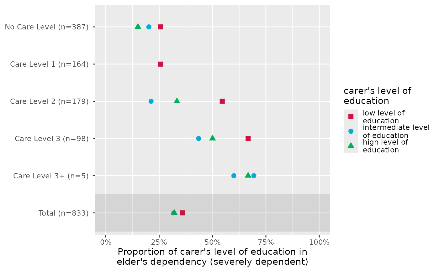
Plot grouped proportional crosstables, where the proportion of
each level of x for the highest category in y
is plotted, for each subgroup of grp.
Usage
plot_gpt(
  data,
  x,
  y,
  grp,
  colors = "metro",
  geom.size = 2.5,
  shape.fill.color = "#f0f0f0",
  shapes = c(15, 16, 17, 18, 21, 22, 23, 24, 25, 7, 8, 9, 10, 12),
  title = NULL,
  axis.labels = NULL,
  axis.titles = NULL,
  legend.title = NULL,
  legend.labels = NULL,
  wrap.title = 50,
  wrap.labels = 15,
  wrap.legend.title = 20,
  wrap.legend.labels = 20,
  axis.lim = NULL,
  grid.breaks = NULL,
  show.total = TRUE,
  annotate.total = TRUE,
  show.p = TRUE,
  show.n = TRUE
)
Arguments
- data
A data frame, or a grouped data frame.
- x
Categorical variable, where the proportion of each category in
xfor the highest category ofywill be printed along the x-axis.- y
Categorical or numeric variable. If not a binary variable,
ywill be recoded into a binary variable, dichtomized at the highest category and all remaining categories.- grp
Grouping variable, which will define the y-axis
- colors
May be a character vector of color values in hex-format, valid color value names (see
demo("colors")) or a name of a pre-defined color palette. Following options are valid for thecolorsargument:If not specified, a default color brewer palette will be used, which is suitable for the plot style.
If
"gs", a greyscale will be used.If
"bw", and plot-type is a line-plot, the plot is black/white and uses different line types to distinguish groups (see this package-vignette).If
colorsis any valid color brewer palette name, the related palette will be used. UseRColorBrewer::display.brewer.all()to view all available palette names.There are some pre-defined color palettes in this package, see
sjPlot-themesfor details.Else specify own color values or names as vector (e.g.
colors = "#00ff00"orcolors = c("firebrick", "blue")).
- geom.size
size resp. width of the geoms (bar width, line thickness or point size, depending on plot type and function). Note that bar and bin widths mostly need smaller values than dot sizes.
- shape.fill.color
Optional color vector, fill-color for non-filled shapes
- shapes
Numeric vector with shape styles, used to map the different categories of
x.- title
Character vector, used as plot title. By default,
response_labelsis called to retrieve the label of the dependent variable, which will be used as title. Usetitle = ""to remove title.- axis.labels
character vector with labels used as axis labels. Optional argument, since in most cases, axis labels are set automatically.
- axis.titles
character vector of length one or two, defining the title(s) for the x-axis and y-axis.
- legend.title
Character vector, used as legend title for plots that have a legend.
- legend.labels
character vector with labels for the guide/legend.
- wrap.title
Numeric, determines how many chars of the plot title are displayed in one line and when a line break is inserted.
- wrap.labels
numeric, determines how many chars of the value, variable or axis labels are displayed in one line and when a line break is inserted.
- wrap.legend.title
numeric, determines how many chars of the legend's title are displayed in one line and when a line break is inserted.
- wrap.legend.labels
numeric, determines how many chars of the legend labels are displayed in one line and when a line break is inserted.
- axis.lim
Numeric vector of length 2, defining the range of the plot axis. Depending on plot type, may effect either x- or y-axis, or both. For multiple plot outputs (e.g., from
type = "eff"ortype = "slope"inplot_model),axis.limmay also be a list of vectors of length 2, defining axis limits for each plot (only if non-faceted).- grid.breaks
numeric; sets the distance between breaks for the axis, i.e. at every
grid.breaks'th position a major grid is being printed.- show.total
Logical, if
TRUE, a total summary line for all aggregatedgrpis added.- annotate.total
Logical, if
TRUEandshow.total = TRUE, the total-row in the figure will be highlighted with a slightly shaded background.- show.p
Logical, adds significance levels to values, or value and variable labels.
- show.n
logical, if
TRUE, adds total number of cases for each group or category to the labels.
Details
The p-values are based on chisq.test of x
and y for each grp.
Examples
if (requireNamespace("haven")) {
  data(efc)

  # the proportion of dependency levels in female
  # elderly, for each family carer's relationship
  # to elderly
  plot_gpt(efc, e42dep, e16sex, e15relat)

  # proportion of educational levels in highest
  # dependency category of elderly, for different
  # care levels
  plot_gpt(efc, c172code, e42dep, n4pstu)
}