Case Study: Logistic Mixed Effects Model With Interaction Term
Source:vignettes/practical_logisticmixedmodel.Rmd
practical_logisticmixedmodel.RmdThis vignette demonstrate how to use ggeffects to compute and plot adjusted predictions of a logistic regression model. To cover some frequently asked questions by users, we’ll fit a mixed model, including an interaction term and a quadratic resp. spline term. A general introduction into the package usage can be found in the vignette adjusted predictions of regression model.
First, we load the required packages and create a sample data set with a binomial and continuous variable as predictor as well as a group factor. To avoid convergence warnings, the continuous variable is standardized.
library(ggeffects)
library(lme4)
library(splines)

set.seed(123)

dat <- data.frame(
  outcome = rbinom(n = 100, size = 1, prob = 0.35),
  var_binom = as.factor(rbinom(n = 100, size = 1, prob = 0.2)),
  var_cont = rnorm(n = 100, mean = 10, sd = 7),
  group = sample(letters[1:4], size = 100, replace = TRUE)
)

dat$var_cont <- datawizard::standardize(dat$var_cont)
Simple Logistic Mixed Effects Model
We start by fitting a simple mixed effects model.
m1 <- glmer(
  outcome ~ var_binom + var_cont + (1 | group),
  data = dat,
  family = binomial(link = "logit")
)
For a discrete variable, adjusted predictions for all levels are calculated by default. For continuous variables, a pretty range of values is generated. See more details about value ranges in the vignette adjusted predictions at specific values.
For logistic regression models, since ggeffects returns adjusted predictions on the response scale, the predicted values are predicted probabilities. Furthermore, for mixed models, the predicted values are typically at the population level, not group-specific.
predict_response(m1, "var_binom")
#> You are calculating adjusted predictions on the population-level (i.e. `type = "fixed"`) for a *generalized* linear mixed model.
#>   This may produce biased estimates due to Jensen's inequality. Consider setting `bias_correction = TRUE` to correct for this bias.
#>   See also the documentation of the `bias_correction` argument.
#> # Predicted probabilities of outcome
#>
#> var_binom | Predicted |     95% CI
#> ----------------------------------
#> 0         |      0.37 | 0.34, 0.40
#> 1         |      0.38 | 0.32, 0.44
#>
#> Adjusted for:
#> * var_cont = -0.00
#> *    group = 0 (population-level)

predict_response(m1, "var_cont")
#> Data were 'prettified'. Consider using `terms="var_cont [all]"` to get smooth plots.
#> # Predicted probabilities of outcome
#>
#> var_cont | Predicted |     95% CI
#> ---------------------------------
#>    -2.50 |      0.34 | 0.28, 0.40
#>    -2.00 |      0.34 | 0.29, 0.40
#>    -1.00 |      0.36 | 0.32, 0.39
#>     0.00 |      0.37 | 0.34, 0.40
#>     0.50 |      0.38 | 0.34, 0.41
#>     1.00 |      0.38 | 0.34, 0.42
#>     2.00 |      0.40 | 0.34, 0.45
#>     3.50 |      0.42 | 0.33, 0.51
#>
#> Adjusted for:
#> * var_binom = 0
#> *     group = 0 (population-level)
#>
#> Not all rows are shown in the output. Use `print(..., n = Inf)` to show all rows.
To plot adjusted predictions, simply plot the returned results or use the pipe.
# save adjusted predictions in an object and plot
me <- predict_response(m1, "var_binom")
plot(me)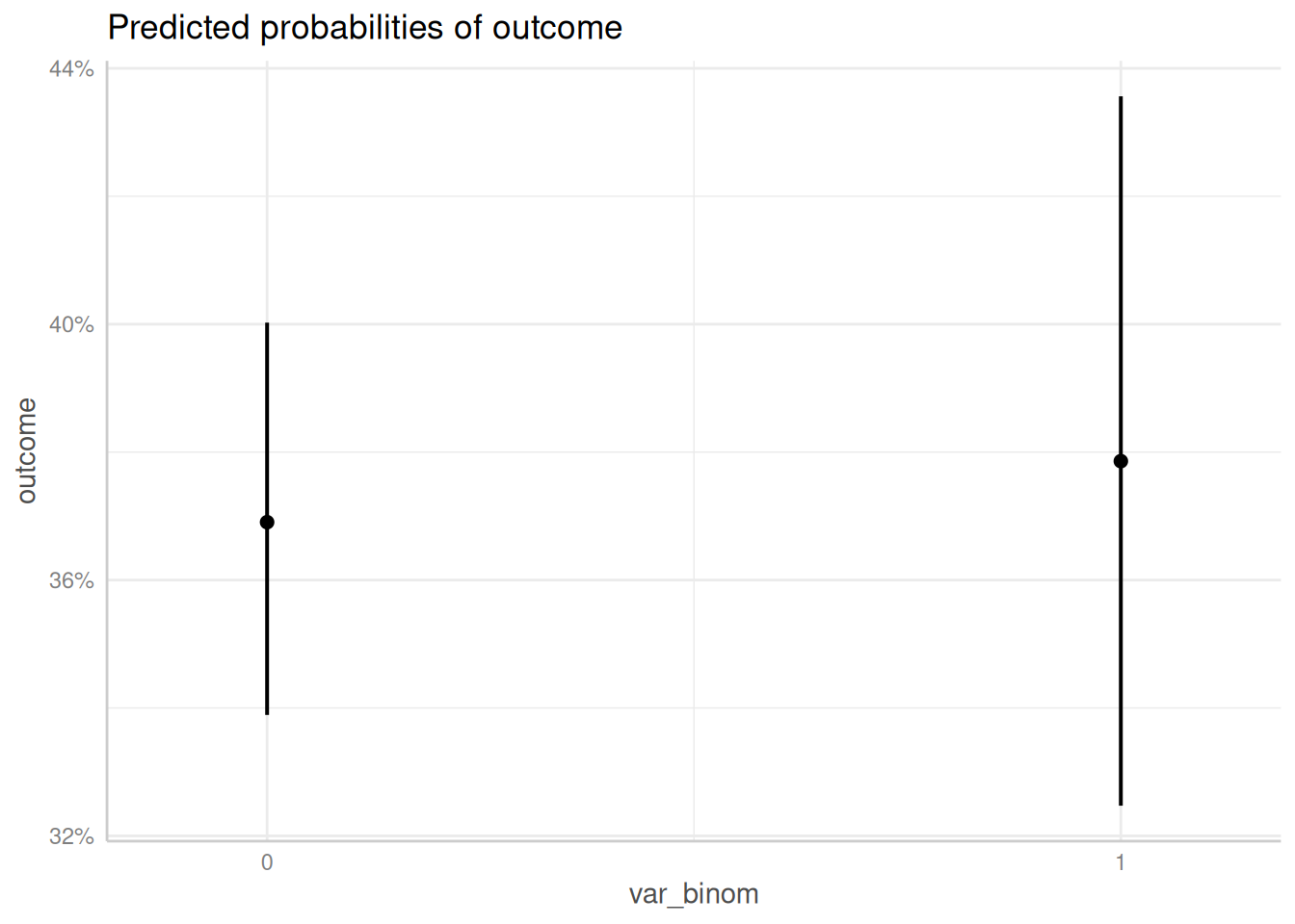
# plot using the pipe
predict_response(m1, "var_cont") |> plot()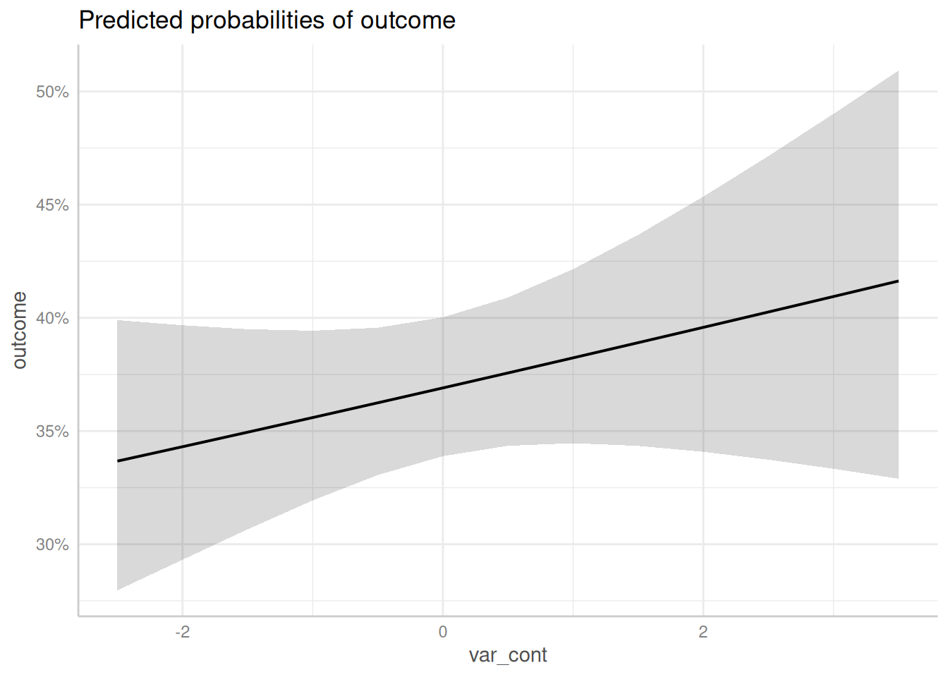
Logistic Mixed Effects Model with Interaction Term
Next, we fit a model with an interaction between the binomial and continuous variable.
m2 <- glmer(
  outcome ~ var_binom * var_cont + (1 | group),
  data = dat,
  family = binomial(link = "logit")
)
To compute or plot adjusted predictions of interaction terms, simply
specify these terms, i.e. the names of the variables, as character
vector in the terms-argument. Since we have an interaction
between var_binom and var_cont, the argument
would be terms = c("var_binom", "var_cont"). However, the
first variable in the terms-argument is used as
predictor along the x-axis. Adjusted predictions are then plotted for
specific values or at specific levels from the second
variable.
If the second variable is a factor, adjusted predictions for each level are plotted. If the second variable is continuous, representative values are chosen (typically, mean +/- one SD, see adjusted predictions at specific values).
predict_response(m2, c("var_cont", "var_binom")) |> plot()
#> Data were 'prettified'. Consider using `terms="var_cont [all]"` to get smooth plots.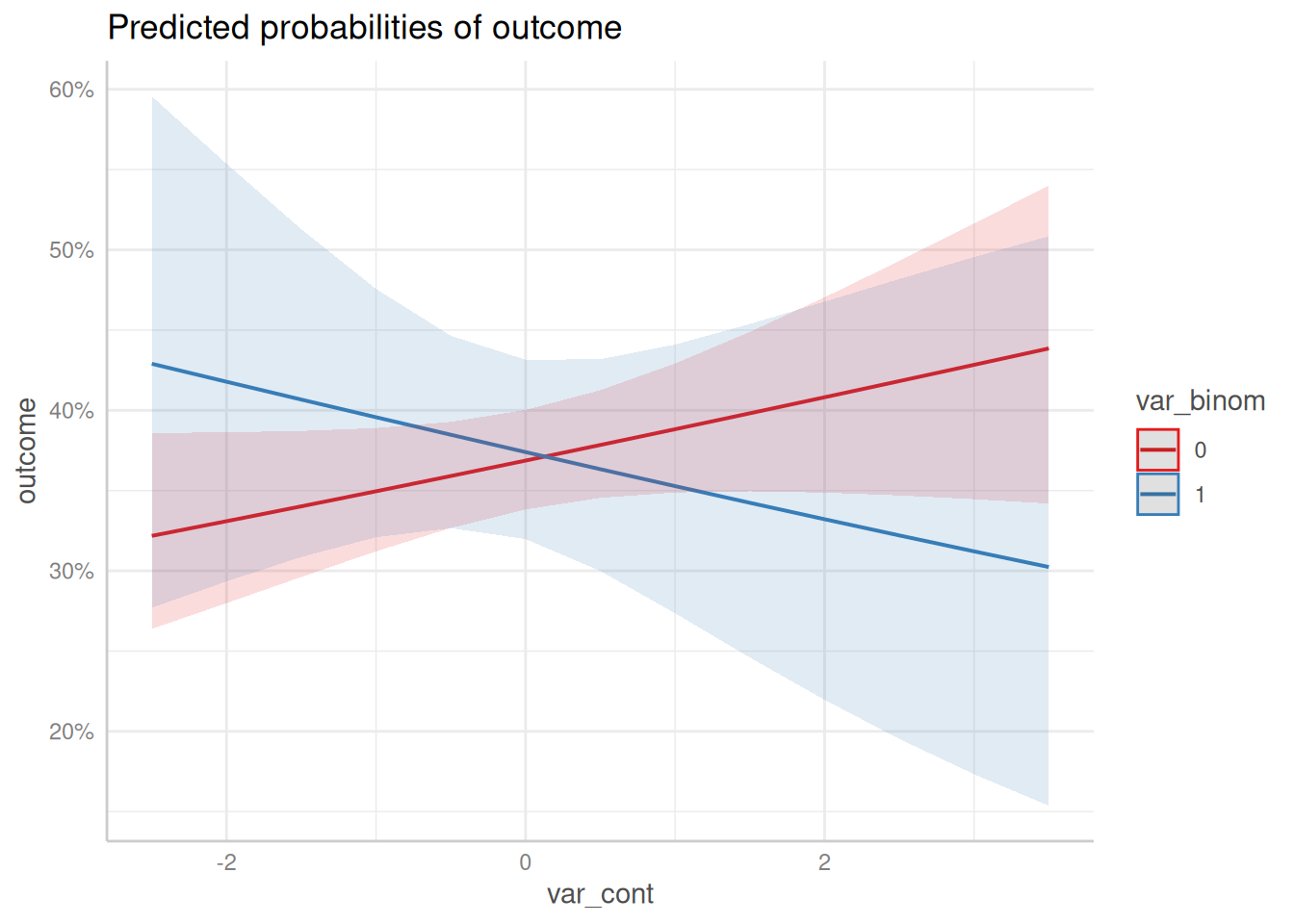
predict_response(m2, c("var_binom", "var_cont")) |> plot()
#> Ignoring unknown labels:
#> • linetype : "var_cont"
#> • shape : "var_cont"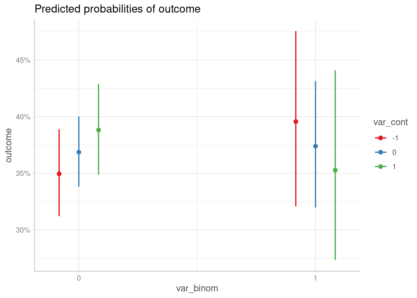
Logistic Mixed Effects Model with quadratic Interaction Term
Now we fit a model with interaction term, where the continuous variable is modelled as quadratic term.
m3 <- glmer(
  outcome ~ var_binom * poly(var_cont, degree = 2, raw = TRUE) + (1 | group),
  data = dat,
  family = binomial(link = "logit")
)
Again, ggeffect automatically plots all high-order terms
when these are specified in the terms-argument. Hence, the
function call is identical to the previous examples with interaction
terms, which had no polynomial term included.
predict_response(m3, c("var_cont", "var_binom")) |> plot()
#> Model contains splines or polynomial terms. Consider using `terms="var_cont [all]"` to get smooth plots. See also package-vignette 'Adjusted Predictions at Specific Values'.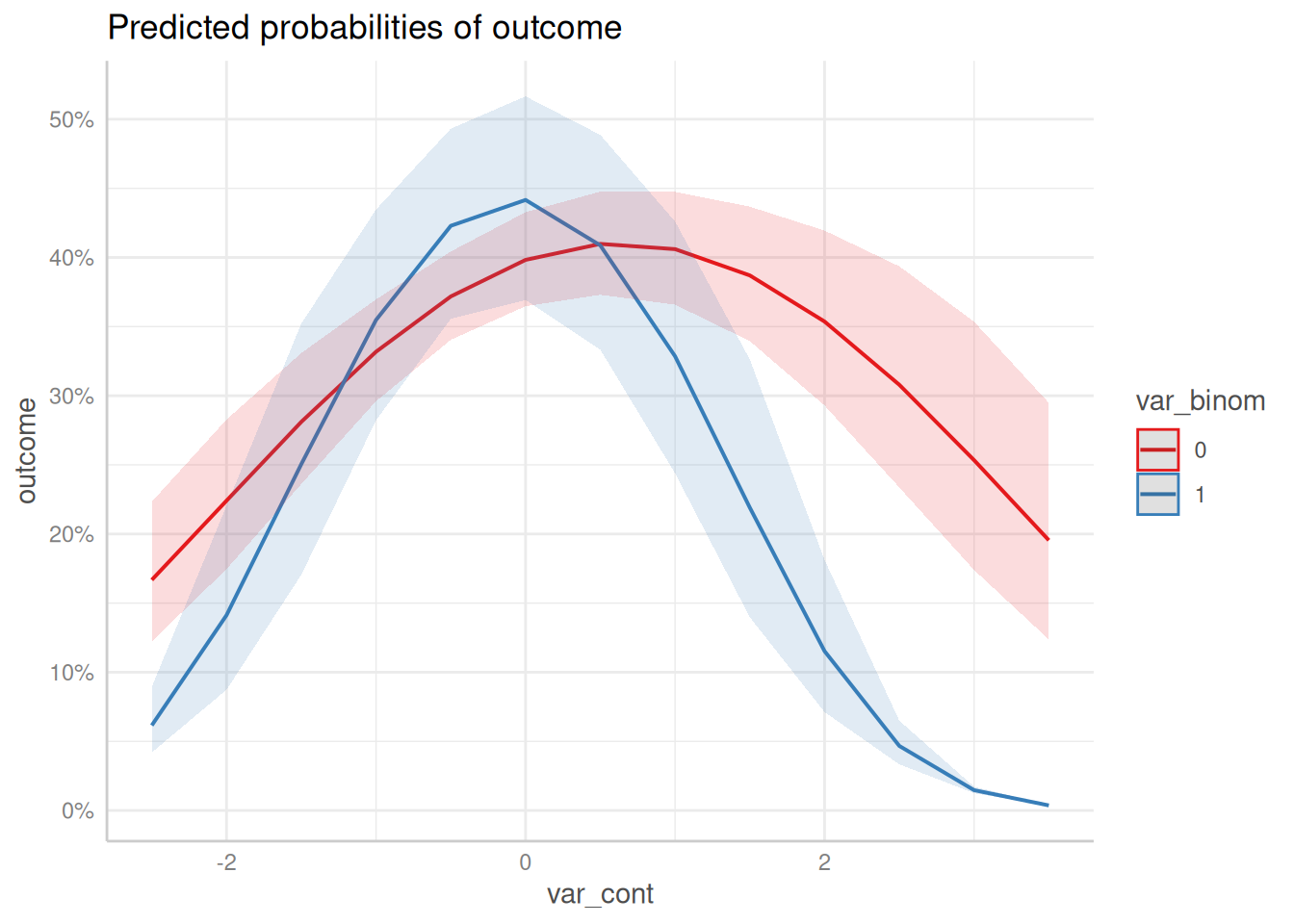
As you can see, ggeffects also returned a message indicated that the plot may not look very smooth due to the involvement of polynomial or spline terms:
Model contains splines or polynomial terms. Consider using
terms="var_cont [all]"to get smooth plots. See also package-vignette ‘Adjusted predictions at Specific Values’.
This is because for mixed models, computing adjusted predictions with
spline or polynomial terms may lead to memory allocation problems. If
you are sure that this will not happen, add the [all]-tag
to the terms-argument, as described in the message:
predict_response(m3, c("var_cont [all]", "var_binom")) |> plot()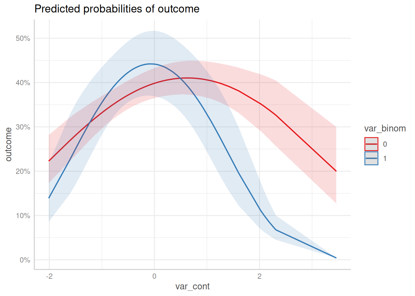
The above plot produces much smoother curves.
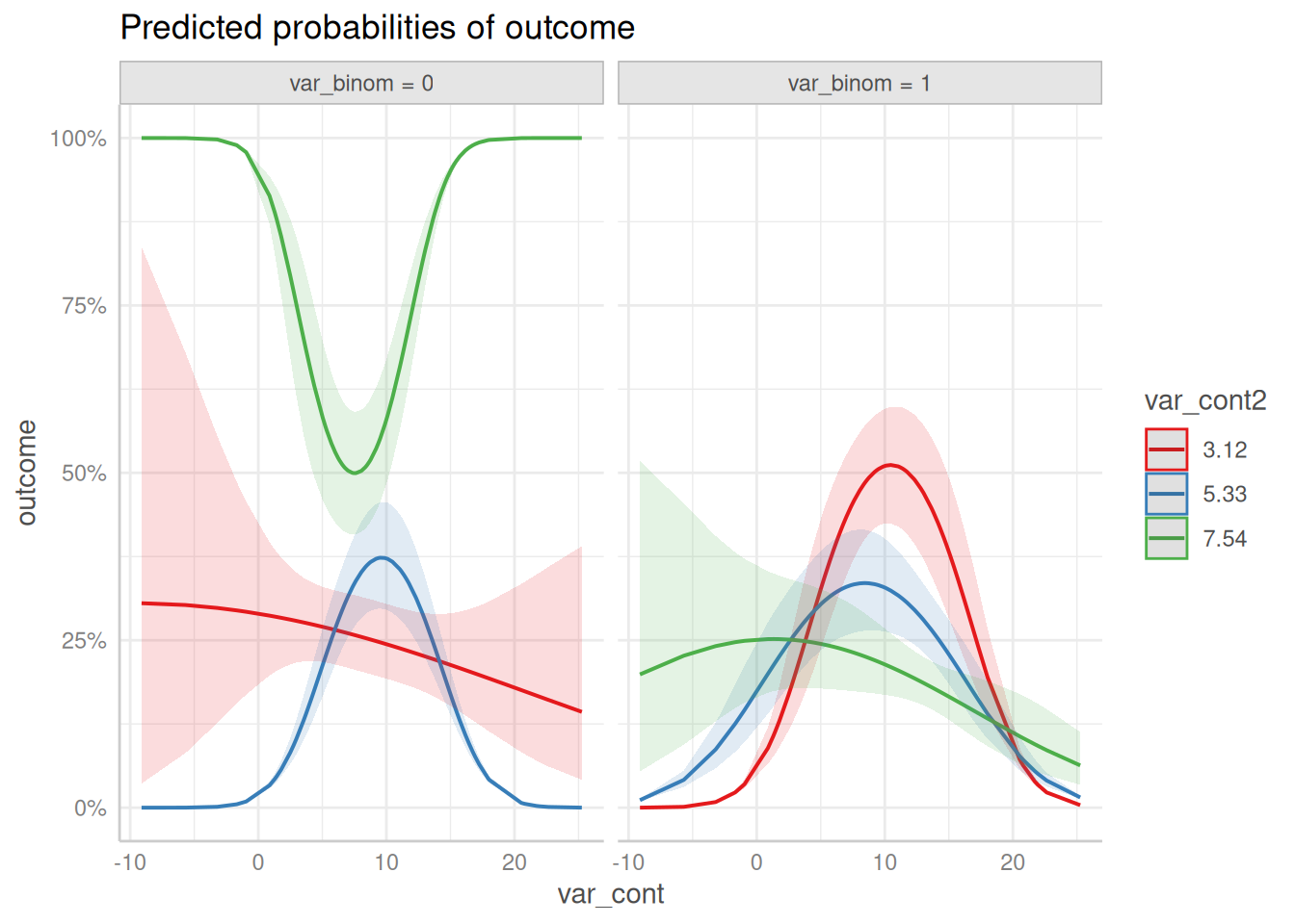
Logistic Mixed Effects Model with Three-Way Interaction
The last model does not produce very nice plots, but for the sake of demonstration, we fit a model with three interaction terms, including polynomial and spline terms.
set.seed(321)
dat <- data.frame(
  outcome = rbinom(n = 100, size = 1, prob = 0.35),
  var_binom = rbinom(n = 100, size = 1, prob = 0.5),
  var_cont = rnorm(n = 100, mean = 10, sd = 7),
  var_cont2 = rnorm(n = 100, mean = 5, sd = 2),
  group = sample(letters[1:4], size = 100, replace = TRUE)
)


m4 <- glmer(
  outcome ~ var_binom * poly(var_cont, degree = 2) * ns(var_cont2, df = 3) + (1 | group),
  data = dat,
  family = binomial(link = "logit")
)
Since we have adjusted predictions for var_cont at the
levels of var_cont2 and var_binom, we not only have
groups, but also facets to plot all three “dimensions”. Three-way
interactions are plotted simply by speficying all terms in question in
the terms-argument.
predict_response(m4, c("var_cont [all]", "var_cont2", "var_binom")) |> plot()